

If Fonts Had Human Psyches
Fontology — the Psychology of Typefaces

Before we crop it like it’s hot and have a helvetica good time with the shitty puns and quips below, I wanted to type a quick message.
Thank you all soo much for your support. Every heart, every comment, and every paid subscription is helping my dreams come true on here.
Your support is never more important than it is right now. I’m trying to make this the year that I go full-time with humor writing. Every person who becomes a paid subscriber is helping me reach more people here—so your support at any level means there’s more people seeing my words. And let’s face it—the world needs more laughter and positivity right now.
At the end of this piece are options to support me for as little as $10/year. Each and every one means the world, and means the world sees more of me in the Subshtick algorithm.
Ok, onto the human psyches, and side-eyes, of typefaces…
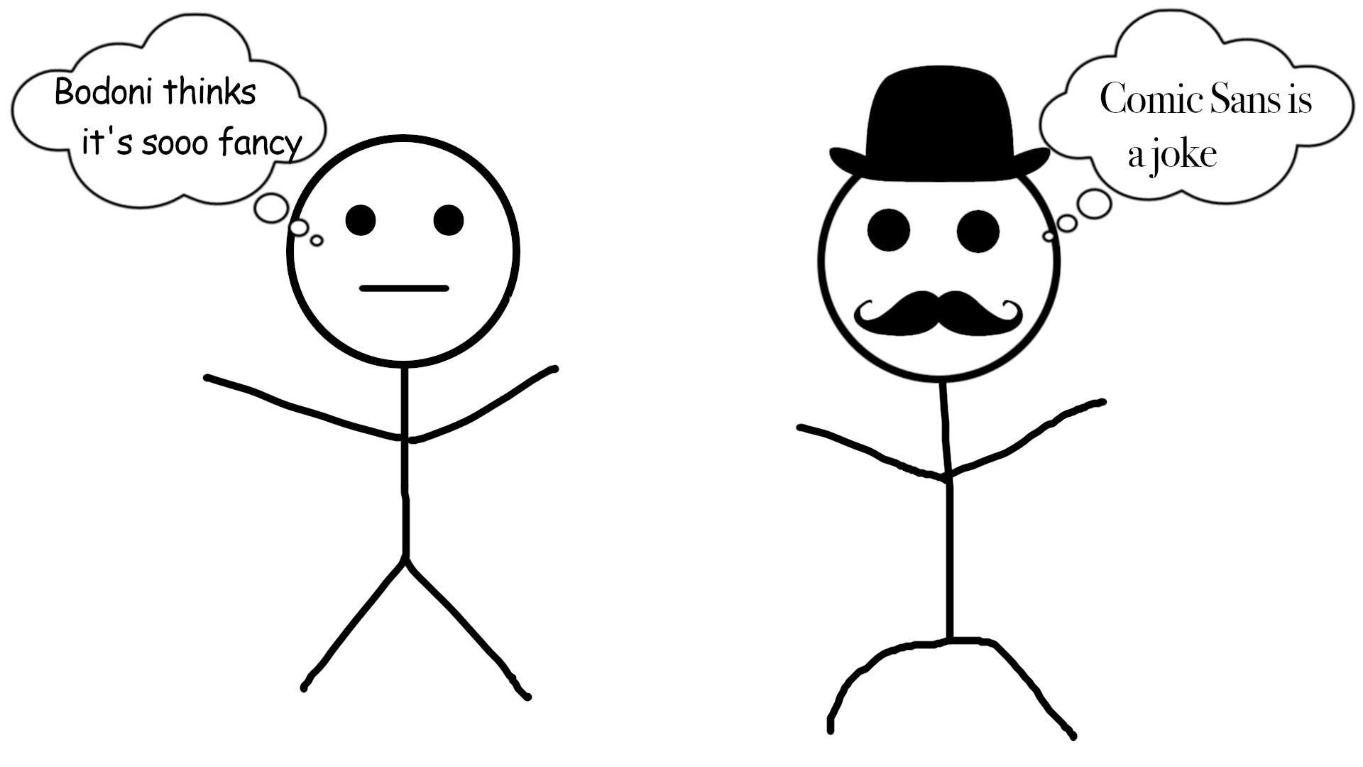
Recently, I was chatting with a group of writer friends about book cover designs, and the chitter-chatter turned to fonts. Yes, we’re nerds — it’s a type thing, you wouldn’t ampersand. You should’ve seen the quarrel about the Oxford comma — someone got shanked.
Typefaces were a contentious topic, with each of us having our own preferences, loathings, and emotions. The only thing we did agree on is that fonts have personalities that elicit strong reactions— and must be chosen wisely when it comes to design.
We humans have oddly primal and strong reactions to fonts. If you doubt that phrase to be true, print off a sign for an office in Comic Sans and watch your coworkers turn into wild animals at the water cooler.
Use Neuland Inline (the font from Jurassic Park) and you’ll see people devolve into caveman-era warring factions fighting over waterholes. If you used Curlz, your fellow coworkers would see your murder as justified.
We’re hardwired for typeface love…and hatred. Enter, font psychology.
Fonts can visually compose a narrative just as your words can paint a picture. A solid script font, with a flowing handwriting look, can denote a personal tale as much as words penning a memoir; the impact of a bold typeface sans serif can sculpt emphasis for a headline; the swooshiness of Curlz adds whimsy to your words.
Use the Papyrus font to design your words and people will expect ancient Greece, or Avatar. Or my 7th-grade bristol-board history presentation on Egypt.
Your typeface choice creates an allusion — an implied visual meaning.
Font psychology was first coined in 1989 by the British Psychological Society after a study linked font use to perceptual qualities, like heavy or light, and fast or slow. A more recent study, by Neurons and the type foundry Monotype, found more emotional responses from fonts — including memorability, trustworthiness, and confidence.
Fonts make us feel things. So your hate for Helvetica is founded. Kind of.
But what if we flipped the tables — and gave fonts human characteristics and feelings…
Fonts Have Feelings Too
In my world, typographies have personalities. Some of them, too much. Including the font Lobster — which mocks the world and only wants to watch it burn. We’ve all seen fonts get a big head, carrying on like they’re the new serif in town.
Let’s look at some of the fonts with more over-the-top personalities than a 90s sitcom…

Bodoni is the Italian playboy of the font family. Like any Italian stallion, it knows its sex appeal and flaunts it.
The typeface was originally designed by serif-aficionado Giambattista Bodoni in 1798, using a combination of narrow and wide strokes to define a more modern look. Bodoni got his start in the font field working at a Catholic press in Rome — and ever since, the typography has considered itself god-like.
The fact that modern brands like Calvin Klein, the Hilton hotels, IBM — and Giorgio Armani — use Bodoni hasn’t helped assuage its cocky attitude. It’s Italian royalty, and it knows it.

Futura is the future of fonts, just ask it. Or rather it was. It’s a century old, designed in 1924, but in its heyday, it was the coolest new kid on the block. It kicked the serifs in the teeth and went geometric modern.
Being part of the nouveau-riche of the typeface world it looks at serifs like they’re hieroglyphics. The old serif fonts punched back, calling them Grotesque, and said the only hieroglyphics in the family are the Dingbats.
Futura cemented its place in the font Hall of Fame by pairing with the innovative Volkswagen — and more modernly the weird party animals of the corporate world, Supreme, IKEA, and Party City. It was also the font on the plaque that the Apollo 11 mission left on the Moon in 1969.
Bodoni drives a Lamborghini —funky Futura drives a Delorean.

Comic Sans is the comedic relief of the typography world. It’s the stoner surfer cousin of the font family who doesn’t take life too seriously. This hippy font hated by most of the internet is beloved by small groups, like the yardsale-sign community.
Fun fact about Comic Sans, if you google its name — the search engine will switch to it. Well played Google, well played.
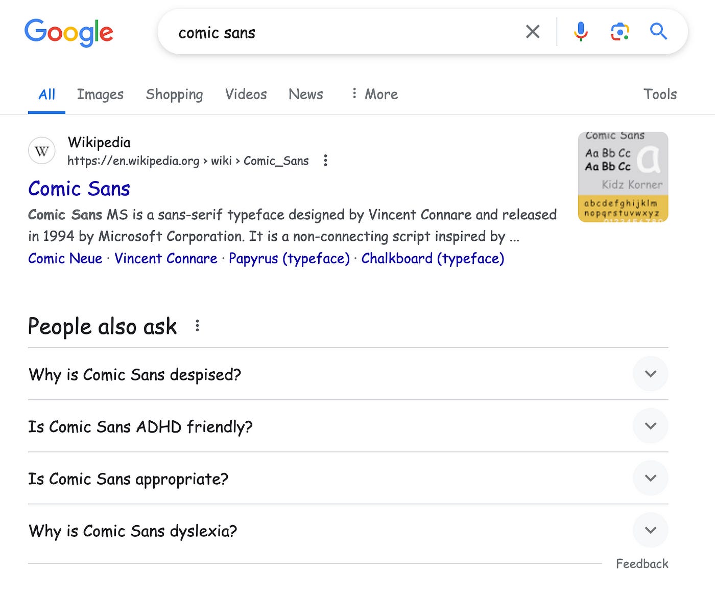
Personally, I love that Comic Sans sends Google into a comical cosmic existential tailspin of questions. Is Comic Sans dyslexia? And why is it the red-headed stepchild of the font family?
As it turns out, Comic Sans has buddied up with the dyslexic community, who find its whimsical look easier to read (although it’s hotly debated). Comics is a niche typeface and a hated one — but it’s found its circle of trust in small communities.

When Helvetica was born in 1957 Switzerland it was called Neue Haas Grotesk, but users found that name too pompous and grotesque so it changed its name to Helvetica.
It has all the cool factors of the Swiss collective from How I Met Your Mother. It was meant to be neutrally cool, its designer created it as a non-partisan font that shouldn’t conjure up any additional meaning. It’s the beige of fonts.
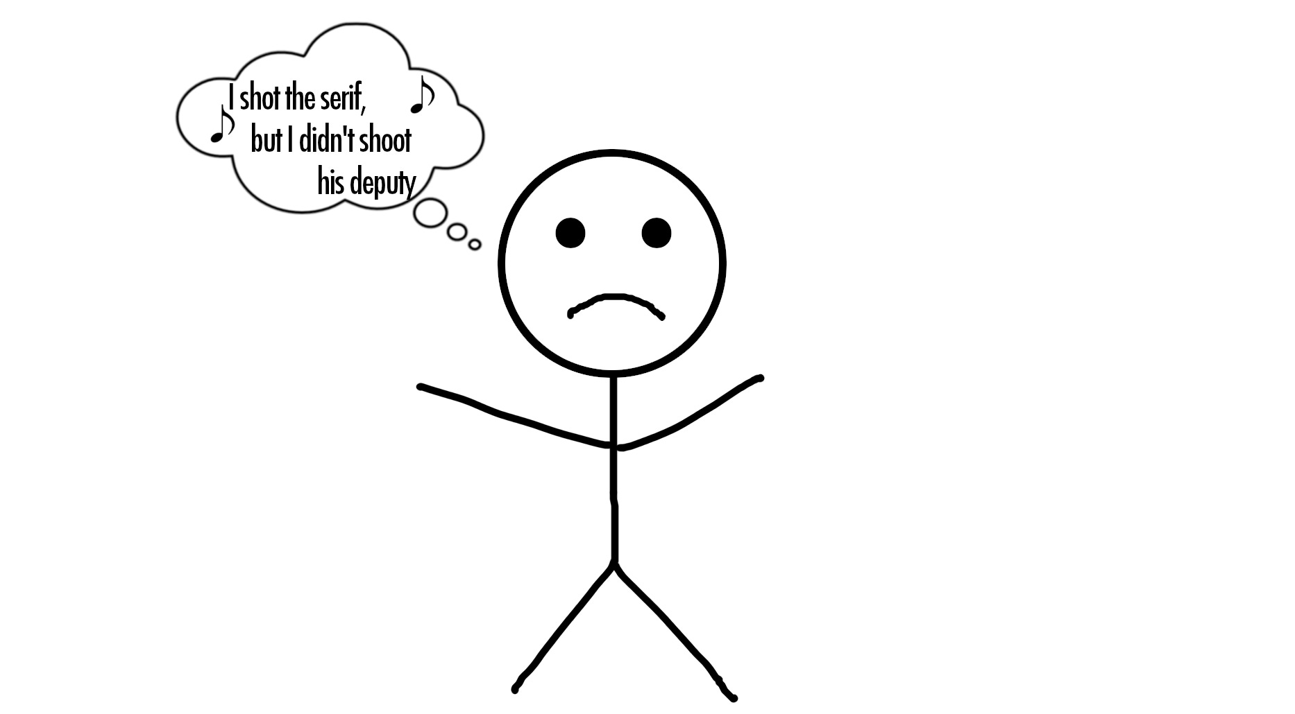
Personality-wise, it’s the typographical embodiment of a trust fund dude named Chad. Too big for its britches and braggadocious. It hangs out with its army of clones, Helvetica Neue, Helvetica Light, and his cousin Akzidenz Grotesk (who himself is braggy about his use by Volvo and the Red Cross).
It’s used by neutral-looking branding from American Apparel and Lufthansa. But don’t let its neutral Swiss appearance fool you, it’s going straight to Hellvetica in a handbasket; it knows how to have a Helvetica good time.

A font made for print that’s been thrust onto the web, Times New Roman refuses to admit defeat, even at the hands of its arch nemesis, Calibri. It was the big honcho for years, being the default font, but it has since been dethroned. Times refuses to be put out to pasture though, and survives primarily on its popularity with 10th graders for their double-spaced essays.
The font world is shockingly cut-throat. Fonts are always gunning for the top position, stabbing each other in the back for it. Calibri replaced Times in a font fight club dual to the death. It was the best of Times, it was the worst of Times.
Aptos then stabbed Calibri in the back to be crowned the latest Microsoft default font. Since then, Times created a superhero duo with Calibri, forming a New Times Bromance. Although, Times behaves more like Spiderman’s editor-in-chief at the Daily Bugle.

Courier was designed to emulate the old-school look of a typewriter’s keystrokes, it was a copy of an older technology and never had its own bold new look. This has given it an inferiority complex right from the beginning.
Ever since it has done everything it can to become a unique and niche font in its own right — meaning it has all the brash of an art critic, and the bravado of a screenwriter. To this day it works to retain its prevalence in professional circles, like screenwriting, tech, and in the legal industry. It’s the only way the old relic can remain relevant.
Since it was originally designed (by IBM) in the 1950s, it has given itself a facelift in a quest to stay youthful — unveiling its Courier ‘New’ look. It has a more streamlined look, with its type stretched tightly across its face for a youthful look. It also got fontly liposuctioned and decided to crop it like it's hot — to appear thinner for its new transformation. But shh, don’t mention that you can still see the antiqueness — it’s more touchy about that than a Hollywood starlet with a botched boob job.

Papyrus is the font embodiment of an ancient paper scroll, and it has the holier-than-thou zen personality to match. It’s a historic poser though and all the other fonts know it. This font baby, spouting sage wisdom, was only formed in 1982.
Papyrus’ designer, Chris Costello designed it at 23 after studying the Bible. He had the lofty ambitions to create a font that looked like it was from Middle-Eastern biblical times.
Papyrus tells people it drives a three-wheeled, fire-brimmed chariot — but in reality, it’s just a font hipster driving a beat-up Oldsmobile.
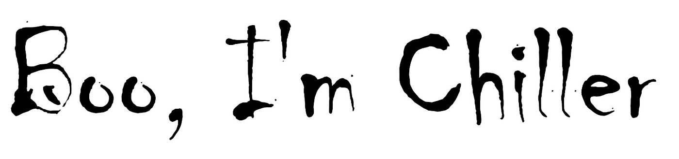
Chiller is the weirdo of the font family. It’s proud of the odd-celebrity crowd it rolls with, like M. Night Shyamalan, Rob Zombie and Edgar Allan Poe. Its friendships align with its personality, dark and twisted. It sends prank ransom notes to Wes Craven on his birthday.
Chiller developed a cult-like following from horror writers, who call their fan club the Serial Chillers.
It drives Bonnie and Clyde’s getaway vehicle, the 1934 Ford Fordor.
Whichever font you choose to get typefaced with, think about how people will react to it. Get surly with Curlzy, get malarial with Arial, or get blurrier with Courier. Just know that your font has an attitude. But if it ever becomes too much ‘tude and you’re getting type screwed — you can break up with a font if it’s not your type.
Viva la fonts.
Do you want to support me but those $5+ per month subscriptions add up? Fair.
I’d absolutely love your support at any level that’s comfortable for you…
$1 per month (would picking the lowest option make you cheap? Nope, I’d love you)
$2 per month (equal love here)
$3 per month (ditto)
$4 per month (you rebel)
$5 per month (full price because I’d be dumb not to include it)
Don’t have any money? Don’t worry, me neither, and I still love you.
I once submitted a letter of resignation in Comic Sans. (Yes, intentionally.)
This was very funny and accurate! I've been in the printing business for 35 years and honestly fonts are the bane of my existence. People, just because you have 50 fonts in your computer, you DO NOT HAVE TO USE THEM ALL ON ONE FLYER!!!