


The Nameless Brand That Drives Canadians Wild
The Nameless Brand That Drives Canadians Wild
Its hilarious branding campaigns have made this label an iconic household name.

It’s yellower than Big Bird, it makes fun of itself — and it’s one of the biggest brands in the country. It’s ‘no name’. Canada’s most bizarre yet somehow boring and funny brand.
It’s a brand having an existentialist crisis, and I’m here for it.
We’re practical people here in Canada. We tend not to be swayed by fancy shiznit if it costs more. Our favorite source for coffee on the go is the economical Tim Horton’s, where a basic coffee is just under $2.
In fact, a whopping 47% of us list the simplistic brew as our favourite, compared to just 18% for the fancy-pants pricier Starbucks. We also prefer the cost-effective Walmart compared to hifalutin Target; so much so that we booted the chain out.
Perhaps our practicality was engrained in us young, since most years we had to wear snowsuits under our Halloween costumes. This worked surprisingly well for TMNT, where it puffed up the shell — or Batman. But it ruined my Catwoman facade.
For many Canadians like myself, we’ll forego branding to save a buck. Or these days, 37 cents. We need to, our taxes are high and our housing costs are astronomical. I’m told if I want to afford a home, which in this area is about a million dollars, I need to eat less avocado toast and then save another 62 cents on soup.
As an impoverished writer (although that might be an oxymoron) I regularly buy my groceries at the most economical shops. Po’ people like me aren’t shopping at fancy Fortinos or pretentious Metro. We’re going to the Walmarts, the Food Basics, and the No Frills.
I shop at cheap stores with No Frills (an actual store name), buying generic products with no name ® (an actual brand name).


No Frills — Like a Name
There’s a brand called no name. No name’s branding is comically simple, with a bright yellow background and bland, black Helvetica font. A basic-bitch sans serif font for this sans nom (‘no name’, in French) brand.
They even stylized their branding as ‘no name’, without capital letters. I guess capitalization costs extra — and this is Canada’s most cost-effective grocery lineup.
“What’s in a name? Or better yet, what’s in no name® products? The answer is, quality without having to pay top dollar. Just look for the yellow packs. They’re hard to miss.” no name’s website slogan.
They’re right, you can’t miss them. Especially in my pantry, which is chocked full of yellow cans of “beans”, “peas assorted sizes” and “poutine gravy sauce”.
As a kid, I didn’t know ‘no name’ was a brand. I thought I lived in some sort of Truman Show reality, and these were just props that existed in the cupboard. I’d look in the pantry, and see a yellow can with the giant word “corn” on it. In my mind, that’s just how canned corn existed.
It’s so iconic that some of us (myself included) refer to generic brands as ‘no-name brands’.
Launched in 1978 by the Loblaws grocery group, no name products have been around my entire life. Their initial drop of 16 products beat their competitors…in just 24 hours. With their simple promise of savings of up to 40% over national brands, they delivered like a brick through a glass-paned window. Hard.
A few months later, they launched the No Frills stores. Albeit would’ve been funnier if they called them the Basic Bitch stores.
By the mid-80's they had over 500 products, and were the top-selling brand in the country. These days they have almost 3,000 products.
Their success comes from a no-muss, no-fuss product lineup and quite frankly, being the cheapest around with reasonable quality. They were a staple item in middle- and lower-income pantries — and poverty pantries like mine. A background product. That was until 2019.
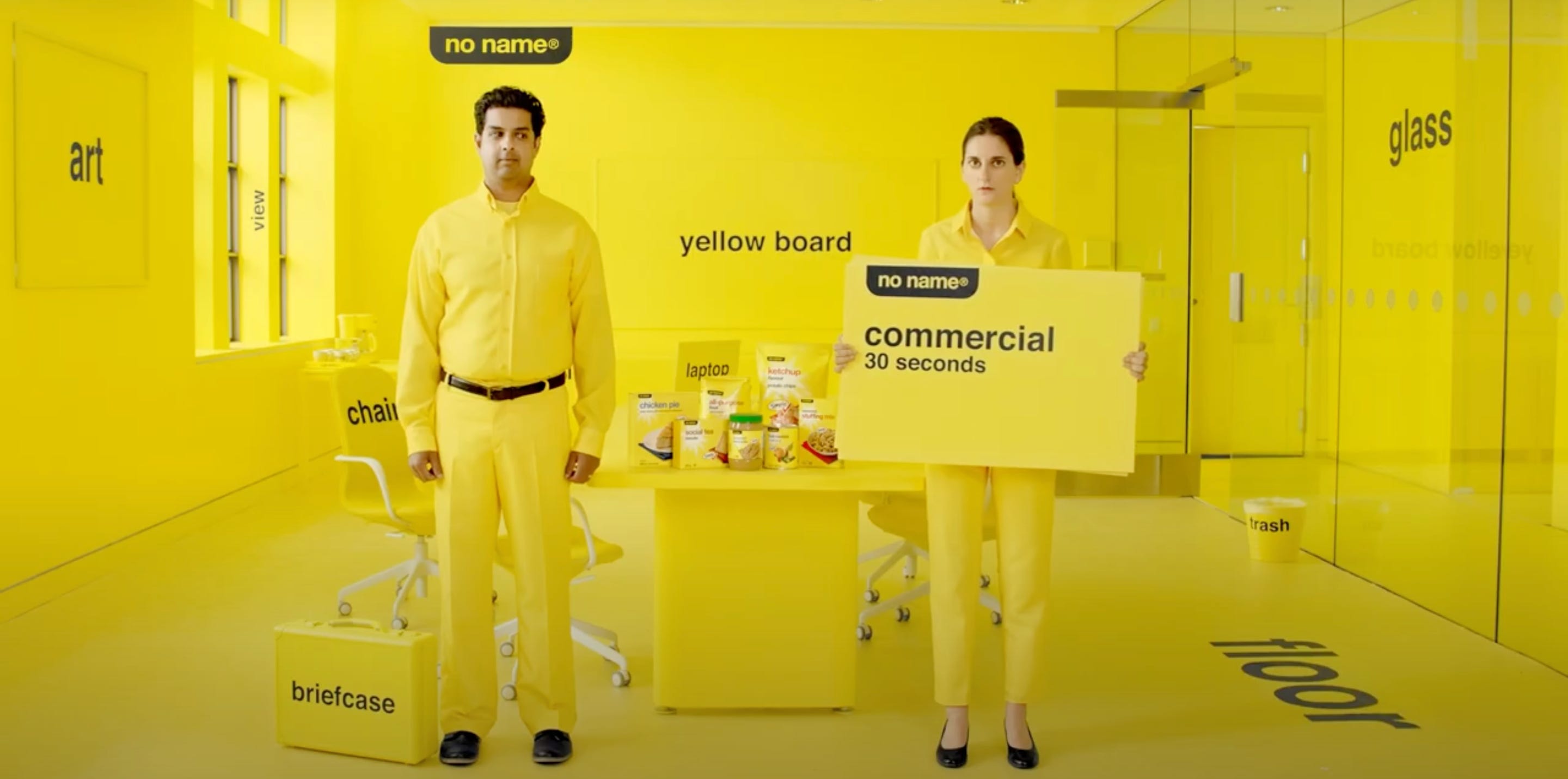
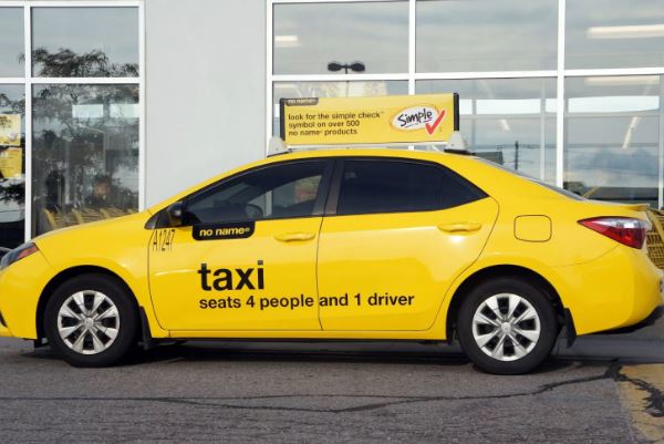
In 2019 they developed the secret sauce that brought this back-of-the-pantry item to the forefront — epic and hilarious advertising. Brands were getting sassy in their ads and they wanted in on the saucy action.
They wrapped yellow taxi cabs with the banner, “taxi — seats 4 people and 1 driver”, subway walls that said “subway platform — with assorted commuters” and even a single, fully-wrapped yellow row townhouse in Toronto that just said “building”.
Whoever came up with those deserves a cookie, albeit a generic one.
Brands like Wendy’s were getting smart-alecky on social media, and no name wanted in. They made a website homepage that simply said “this is a website” — and a Twitter page simply stating, “i am a brand. follow me”.
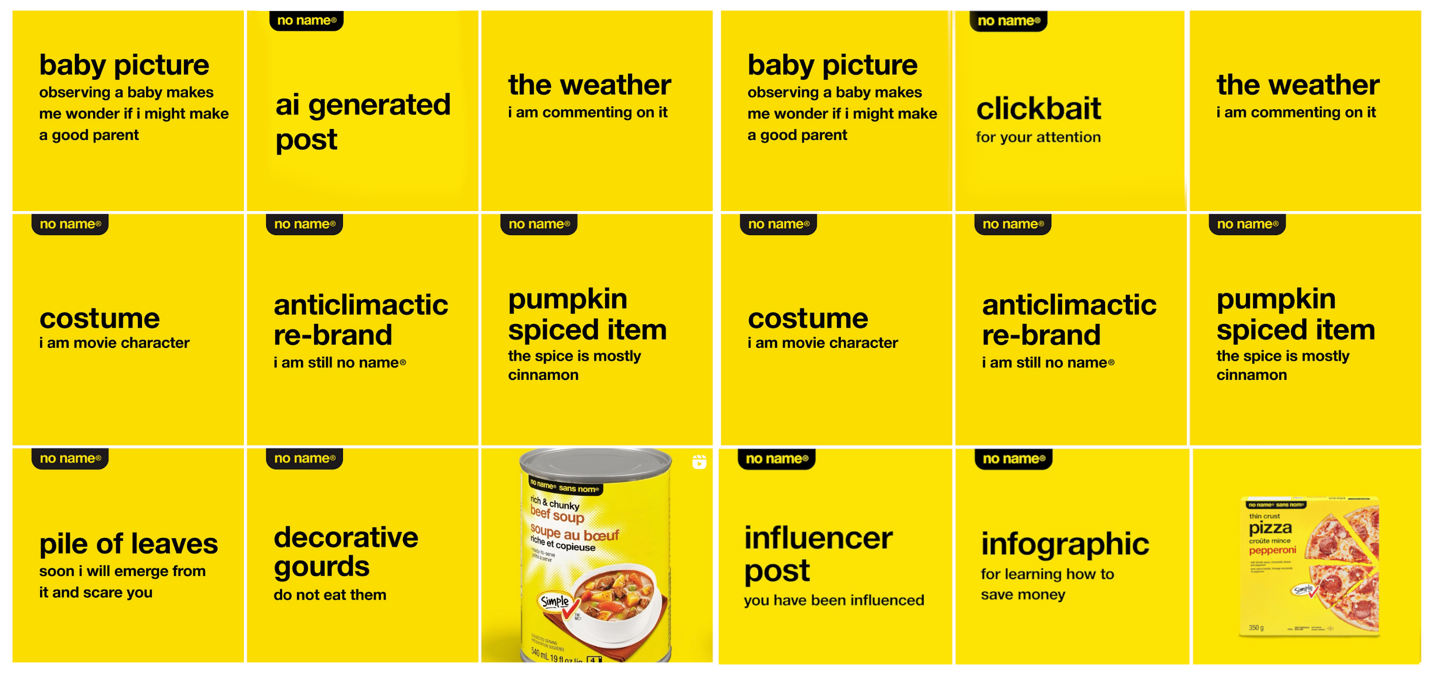
Their social media marketing is so laughably on-point. Their Instagram mocks social media marketing in the most phenomenal ways, poking fun at AI, influencers, clickbait, and the entire concept that IG is just pretty visuals.
Alongside their yellow guerilla marketing campaigns for the brand relaunch, they’ve added two simple product lines, Simple Check and Naturally Imperfect.
Simple Check is a lineup of products without things like artificial flavours, colours, and sweeteners — and Naturally Imperfect, affordable fresh produce that comes in slightly wonky shapes (disqualifying them for public sale in most cases).
The Naturally Imperfect line of veggies gives me an added layer of laughter due to the sheer number of times I’ve seen something naughty in their awkward, often phallic shapes. They’ve clearly noticed that too, based on the suggestively canoodling carrots on their website.
This brand is trolling us and I for one am here for it. It’s marketing gold, but in yellow.
Know your Audience
When it comes to marketing — know your market. No name does. Theirs is cost-conscientious customers (po’ people like me) who also need a laugh. No name pokes fun at themselves, which is a Canadian cultural pastime that they tapped into perfectly imperfectly.
They’re irreverently using an engrained cultural technique, based on modern guerilla marketing warfare tactics, to get eyes on their cheap-but-conscientious products the customers want.
Their un-branding strategy isn’t unlike my own, sass-fuelled basic-bitchness that appeals to like-minded people. Sometimes in marketing, you don’t need to overthink things — all you need is some canoodling carrots or fondling fruit.
*This post was not sponsored by the colour yellow, yet.
coffee filters, canned artichokes, dry sweeper cloths, yellow bags of spices..., these are a few of my favourite things 🎶💛
There is a company in this part of North America that packages water in plain, white containers. No fancy, expensive colour, no celebrity faces, just white paper and water inside. And it tastes pretty good, too.